Exploring styling with Intel XDK - 2
In this post we take a look at media queries and how they enter styling in Intel XDK projects.
Media queries came about in CSS3. In CSS2, the @media rule was introduced to address the different media types (desktop screens, printers, handheld etc). However this did not taek off except fro prit media type.
Media queries look for the type of support or capability available on the device to tailor the styling.
Media queries checks many things including display related variables like,
Media query has the @media rule and the query syntax. The syntax of media query is:
@media not|only mediatype and (expressions) {
CSS-Code;
}
The result of the media query returns true if,
<link rel="stylesheet" media="mediatype and|not|only (expressions)" href="print.css">
There are basically four different media types:
all (for all media types); print(for printers);screen(computer screens, tablets, smart phones, etc) and speech(for screen readers).
In my previous post using Intel XDK, the style code I created for the background using the built-in styling feature resulted in this media query:
@media all {
#afui .Paleblue .panel {
background-color: rgba(128, 128, 255, 0.34);
background-position: center center;
background-repeat: no-repeat;
background-attachment: fixed;
}
}
In another test project, I created a round button using the built-in styling feature as shown.
The displayed round button:

mediaqry_00
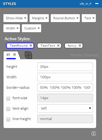
This was designed using the interactive built-in styling feature shown here:

mediaqry_01
This gets into the index_main.less.css as shown below:
@media all {
#afui .TestRound {
height: 30px !important;
width: 100px !important;
border-radius: 50% 100% 100% 100% !important;
}
}
Irrespective of media type, the css rule applies to all devices. Since we are using the interactive designer this css rule is automatically created.
Media queries came about in CSS3. In CSS2, the @media rule was introduced to address the different media types (desktop screens, printers, handheld etc). However this did not taek off except fro prit media type.
Media queries look for the type of support or capability available on the device to tailor the styling.
Media queries checks many things including display related variables like,
- Width and height of viewport
- Width and height of device
- Device Orientation (Landscape/portrait)
- Resolution
Media query has the @media rule and the query syntax. The syntax of media query is:
@media not|only mediatype and (expressions) {
CSS-Code;
}
The result of the media query returns true if,
- The media type matches the type of device the document is beign displayed
- All expressions in the media query is true
<link rel="stylesheet" media="mediatype and|not|only (expressions)" href="print.css">
There are basically four different media types:
all (for all media types); print(for printers);screen(computer screens, tablets, smart phones, etc) and speech(for screen readers).
In my previous post using Intel XDK, the style code I created for the background using the built-in styling feature resulted in this media query:
@media all {
#afui .Paleblue .panel {
background-color: rgba(128, 128, 255, 0.34);
background-position: center center;
background-repeat: no-repeat;
background-attachment: fixed;
}
}
In another test project, I created a round button using the built-in styling feature as shown.
The displayed round button:

mediaqry_00
This was designed using the interactive built-in styling feature shown here:
mediaqry_01
This gets into the index_main.less.css as shown below:
@media all {
#afui .TestRound {
height: 30px !important;
width: 100px !important;
border-radius: 50% 100% 100% 100% !important;
}
}
Irrespective of media type, the css rule applies to all devices. Since we are using the interactive designer this css rule is automatically created.


Comments